Brief Video Tutorial
Full Step-by-Step Guide
- The first table on this report page provides the specific branch information, deposits ($) for that branch, 12 month deposit growth (%), and deposit market share rank in the selected market radius.
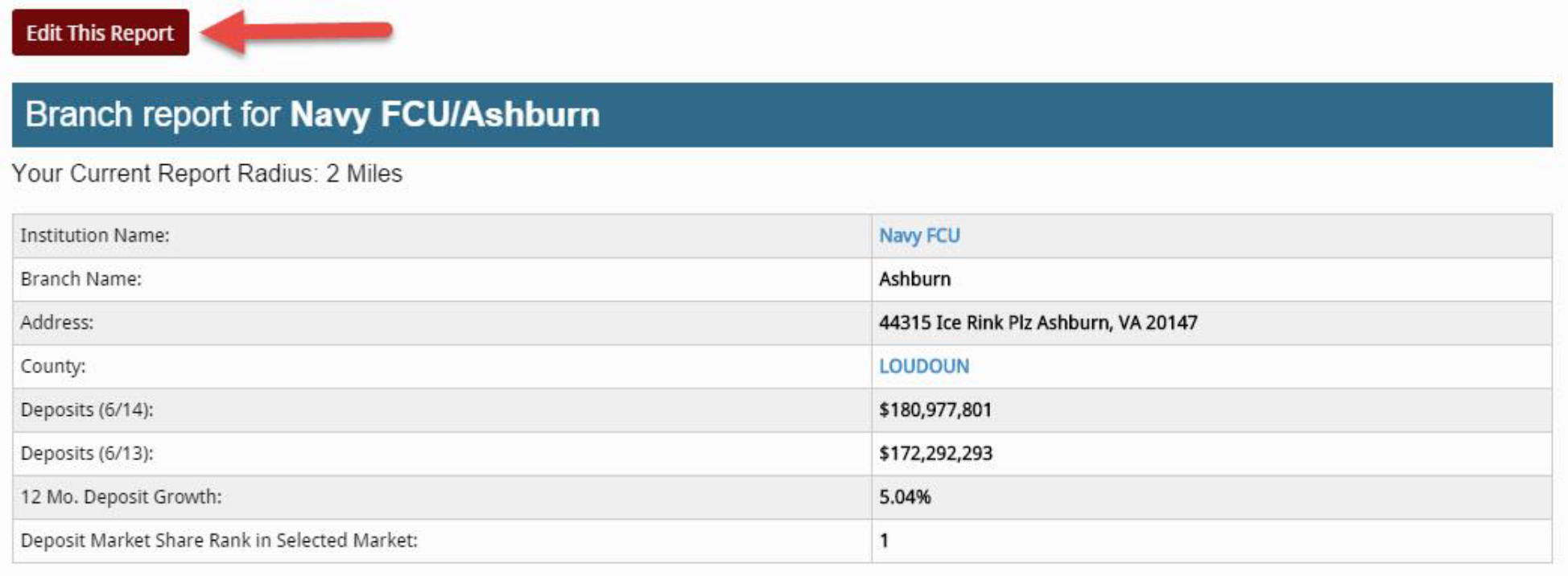
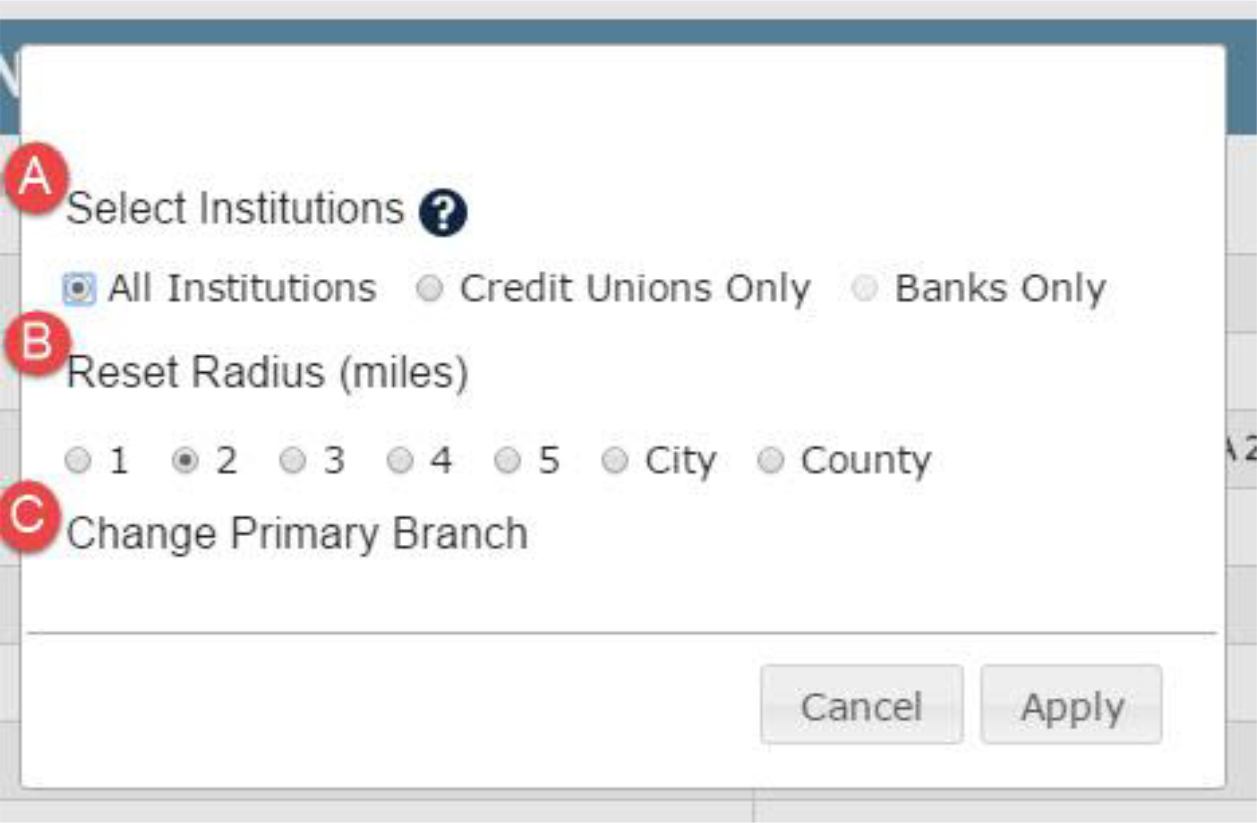
Tip: If you wish to modify the branch report, click on the “Edit This Report” button. From there, you may…- Choose to view only credit unions or only banks
- Reset the radius, or select city or county
- Change the Primary Branch
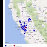
- Reading the map:
- The map plots the primary branch as the center coordinate of the radius you selected.
- All the other branches that operate in the defined radius are represented by pins, which are color-coded by institution type.
- Green = primary branch
- Orange = bank branch
- Blue = credit union branch
- Black = closed branch
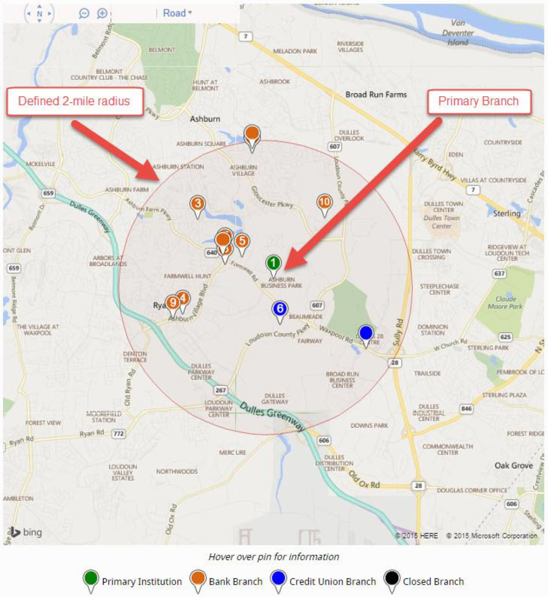
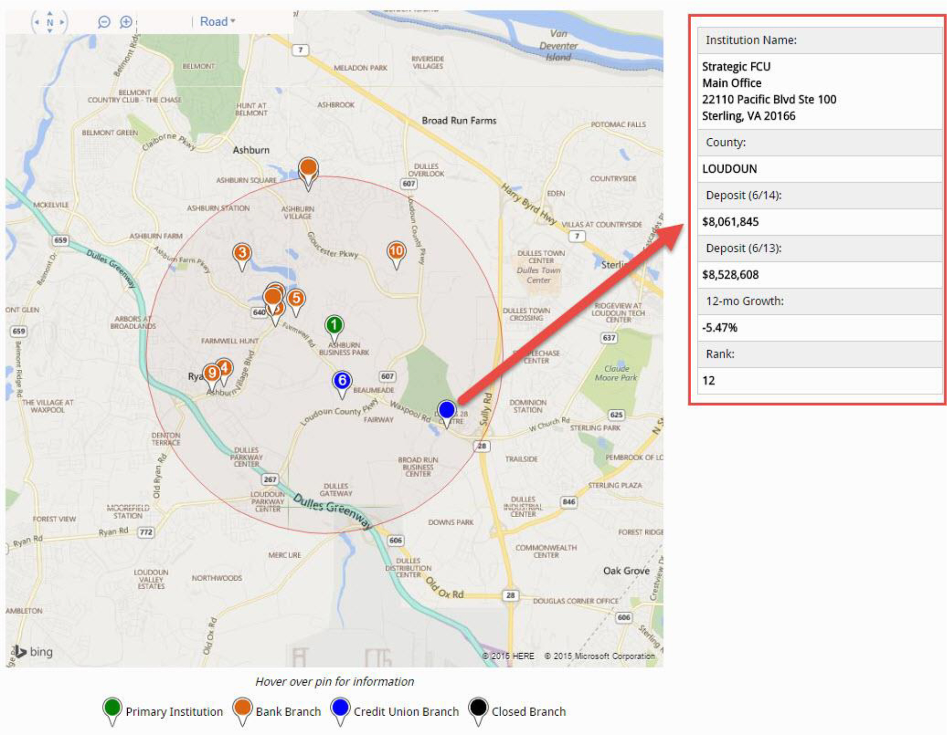
- Hover over any pin to view specific branch information, including deposits ($) for that branch, 12 month deposit growth (%), and deposit market share rank in the selected market radius.
Tip: Use the “+” and “-“ buttons to zoom in and out on the map.
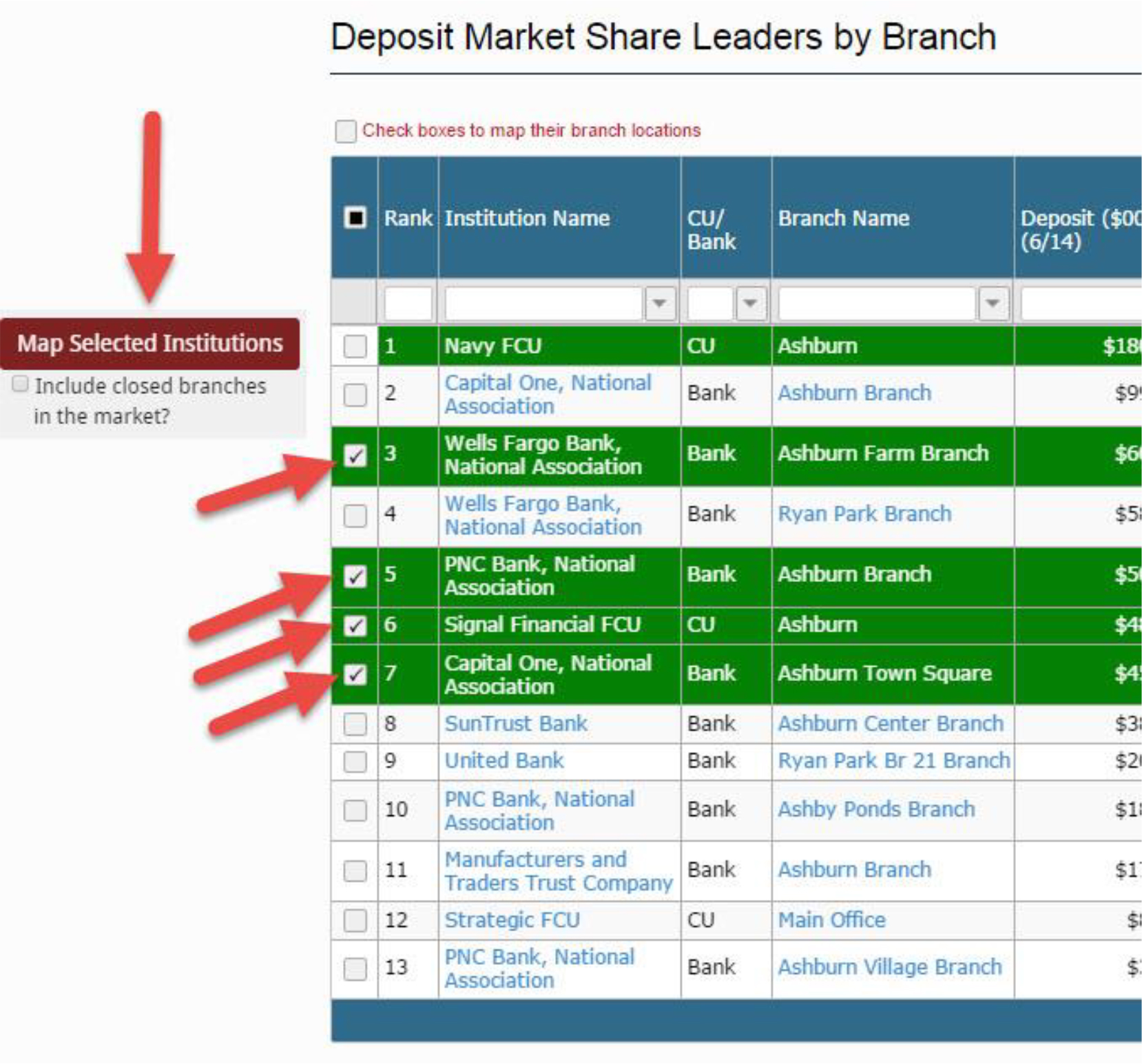
- The “Deposit Market Share Leaders by Branch” table shows all the branches in the defined market radius. The rank defaults to deposit market share.
- To resort the table, hover over any column header and click on the arrow that appears. You may sort ascending or descending.
- Type values in any of the search bars to filter the table. Just want to look at CUs? Type “CU” in the appropriate search bar column.
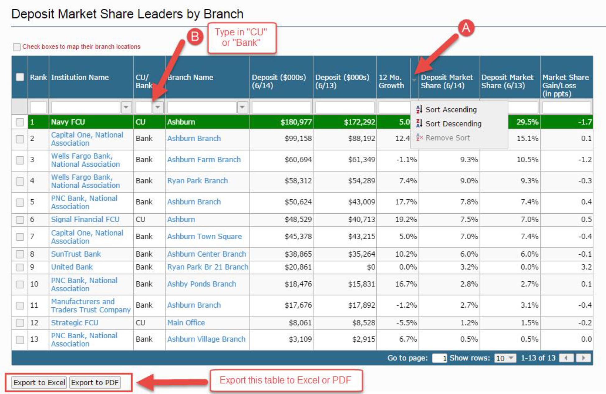
- Map it! If there are specific branches you wish to map, check those boxes to the left of “Rank”. Then click the “Map Selected Institutions” button, which will open a new tab with branch pins for those locations you checked.
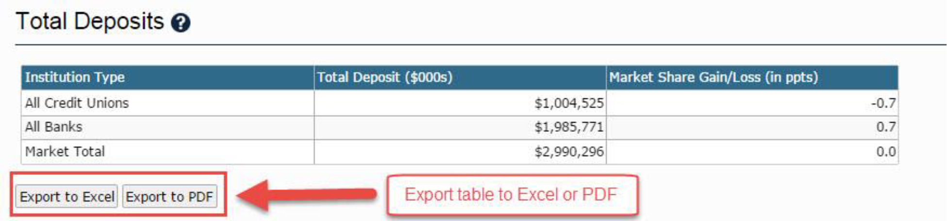
- The “Total Deposits” table is a great way to gauge the size of the market (in terms of $ of deposits) on an institution-type level. The “Total Deposits” table also provides YOY market share gain / loss.
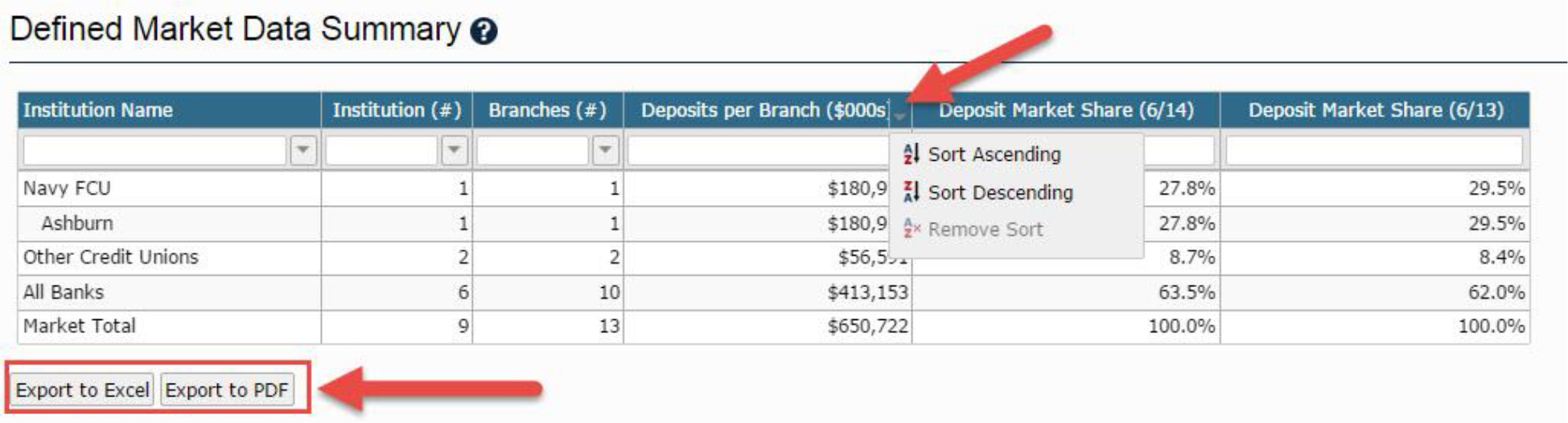
- The “Defined Market Data Summary” table displays your primary branch’s deposits and deposits per branch for all other CUs and Banks in your defined market. You may re-sort this table by hovering over any column header and clicking on the arrow that appears.
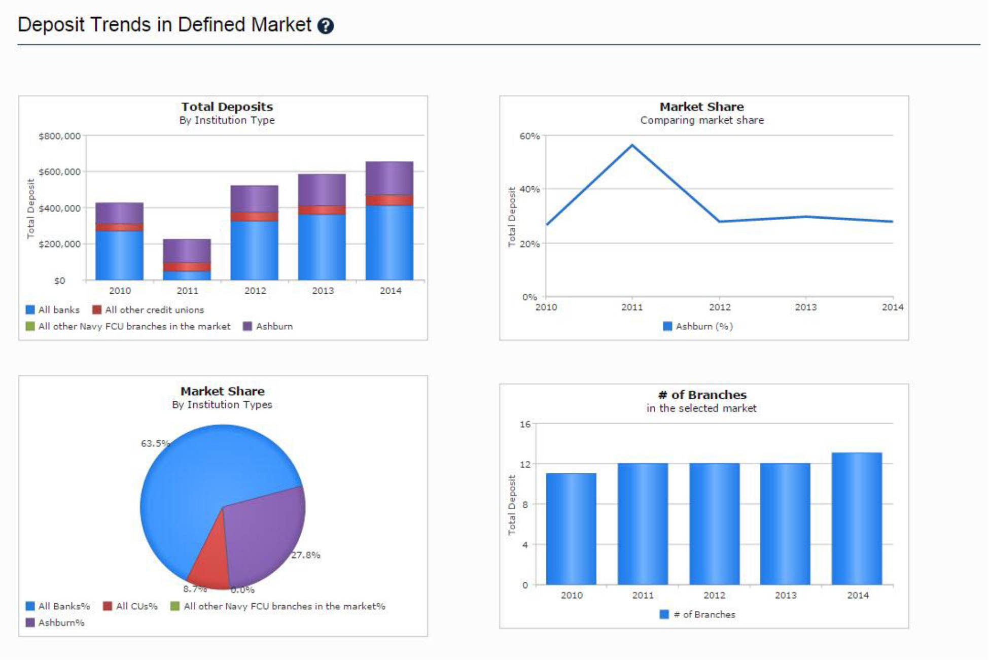
- The 4 “Deposit Trends in Defined Market” graphs are intended to help you better understand how your primary branch is performing relative to the market.
- Branch closures from the previous year’s reporting period to the current year’s reporting period appear in the “Branch Closures” table. These branches would also be represented by black pins on the map, and help you locate vacated branches you may want to move into!

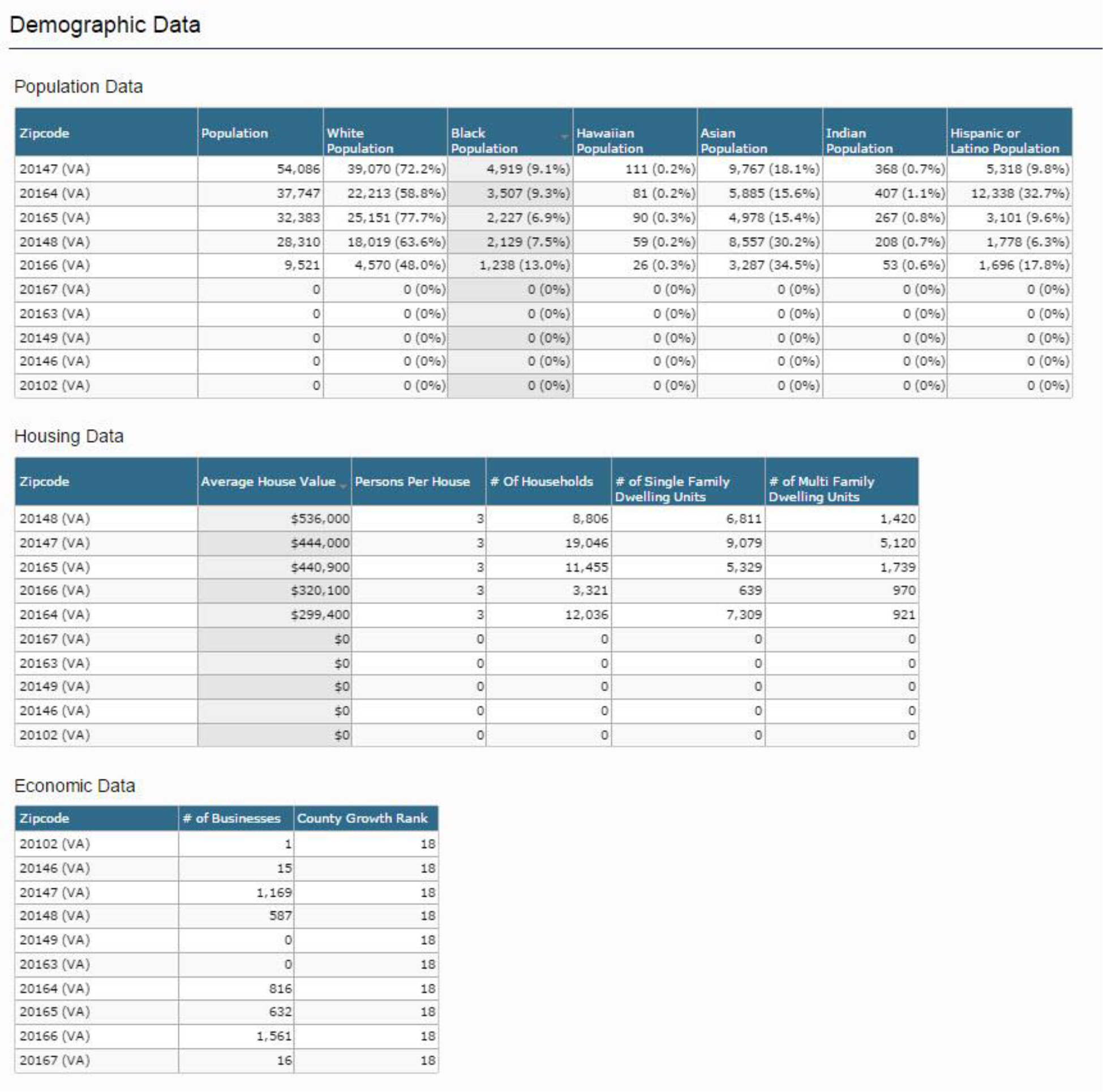
- Tables in the “Demographic Data” section show Population Data, Housing Data, and Economic Data broken down by zip codes in the defined radius (or county). Zip codes rows with values of “0” mean that there was no data reported to the census for that area.
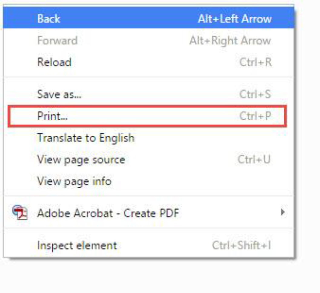
WANT TO PRINT THE ENTIRE BRANCH REPORT?
- Right click anywhere on the screen
- Click “Print”