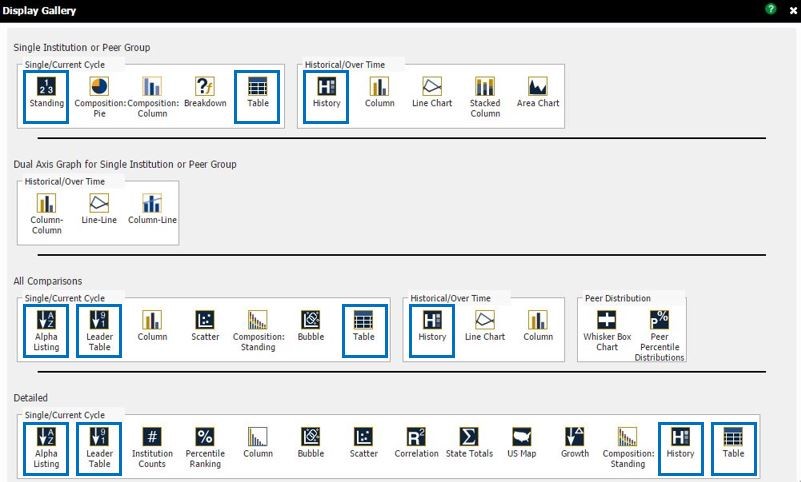
Tables enable your data to be displayed in a row and column format.
Below is a list describing the differences between the tables that can all be found in your Display Gallery.

There is a total of 5 different table types in the Display Gallery.
So why are there 11 boxes highlighting the different tables above?
It’s because the 5 table types have different variations and are therefore placed under multiple categories.
Here is a brief explanation of the category types:
Single Institution or Peer Group Row
These tables will populate data for only a single credit union or a single peer group that you have in your ‘Primary’
All Comparisons Row
These tables will populate an aggregate average for all credit unions and peer groups included in your ‘Primary’ and ‘Comparison Set’
Single/Current Data Cycle Sections
This section will only display data for a single cycle data (1Q17 for example)
Detailed Row
These tables will populate individual institutional data for all credit unions and peer groups included in your ‘Primary’ and ‘Comparison Set’
Historical/Over Time Sections
This section will display data over multiple cycles for a historical analysis
Here is a brief explanation of the table types – these are the names you can see listed as options in the Display Gallery:
Standing
This display will populate data for the metrics you enter as a column along with a rank, out of (i.e. how many credit unions are you comparing your credit union to), percentile rank, and peer average columns for each metric.
Table
This display is a general data table and gives you the most flexibility in terms of formatting. The metrics you enter will display as a column.
Alpha Listing
This display will populate data for the metrics you enter as a row. The results will appear in alphabetical order.
Leader Table
This display ranks the institutions that you are analyzing by the metric you enter from high to low. The column headings are responsive, so clicking on the column headings will re-rank your data according the metric listed.
History
This display will populate data on a historical basis. In other words, you’ll see data for multiple cycle dates on one table.


