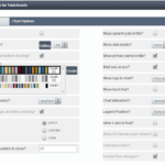
A Whisker Box Chart is a graphical display that shows the percentile distribution of two or more peer groups. This display shows top performers, bottom performers, and where the middle 50th percentile of credit unions in the peer group fall. Now you can quickly view a peer group’s performance distribution to see the highest and lowest performers, as well as everything in between.
To learn more about Whisker Box Charts (how to read them, how to build them, and why they’re valuable), please click the button below to access a helpful document (pdf) with screen shots and textual explanations!
[zilla_button url=”/support/wp-content/uploads/2016/06/Whisker-Box-Chart.pdf” style=”blue” size=”medium” type=”square” target=”_blank”] Download/View PDF [/zilla_button]