In Peer-to-Peer, you have the ability to add highlighting on some of your reports to show where you primary ranks against selected peers in key areas.
The following built-in charts allow you to use this percentile ranking highlighting under Performance Reports:
- 2-Year Financial Comparison (in the Delinquent Loans and Key Ratios sections only)
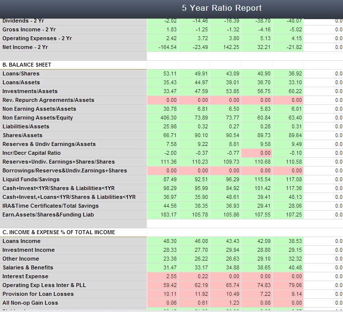
- 5 Year Ratio Report
- 5 Year FPR Report
- 5 Quarter Ratio Report
- 5 Quarter FPR Report
The program defaults to 10%, this means that when you open these charts, if your primary falls in the top 10 percentile for the peer group you are analyzing, the number will highlight green. If they fall in the bottom 10 percentile, the number will highlight red.
To change the percentile, go to ‘Chart Options’. On the bottom right, there is an option that says ‘Highlighting color threshold?’. Change this number to reflect the percentile you wish to highlight. For example, if you put 50 in here, the chart will be all colored and all ratios where the primary is in the top 50 percentile will be green, and the bottom will be red.